Bold shapes and primary colors make a phone look sharp, but they can also make it hard to use. This guide gives you a free geometric phone wallpaper set in the Bauhaus style, three designs for iPhone and Android, and shows you how to keep a bold wallpaper readable so your icons and clock never get lost.
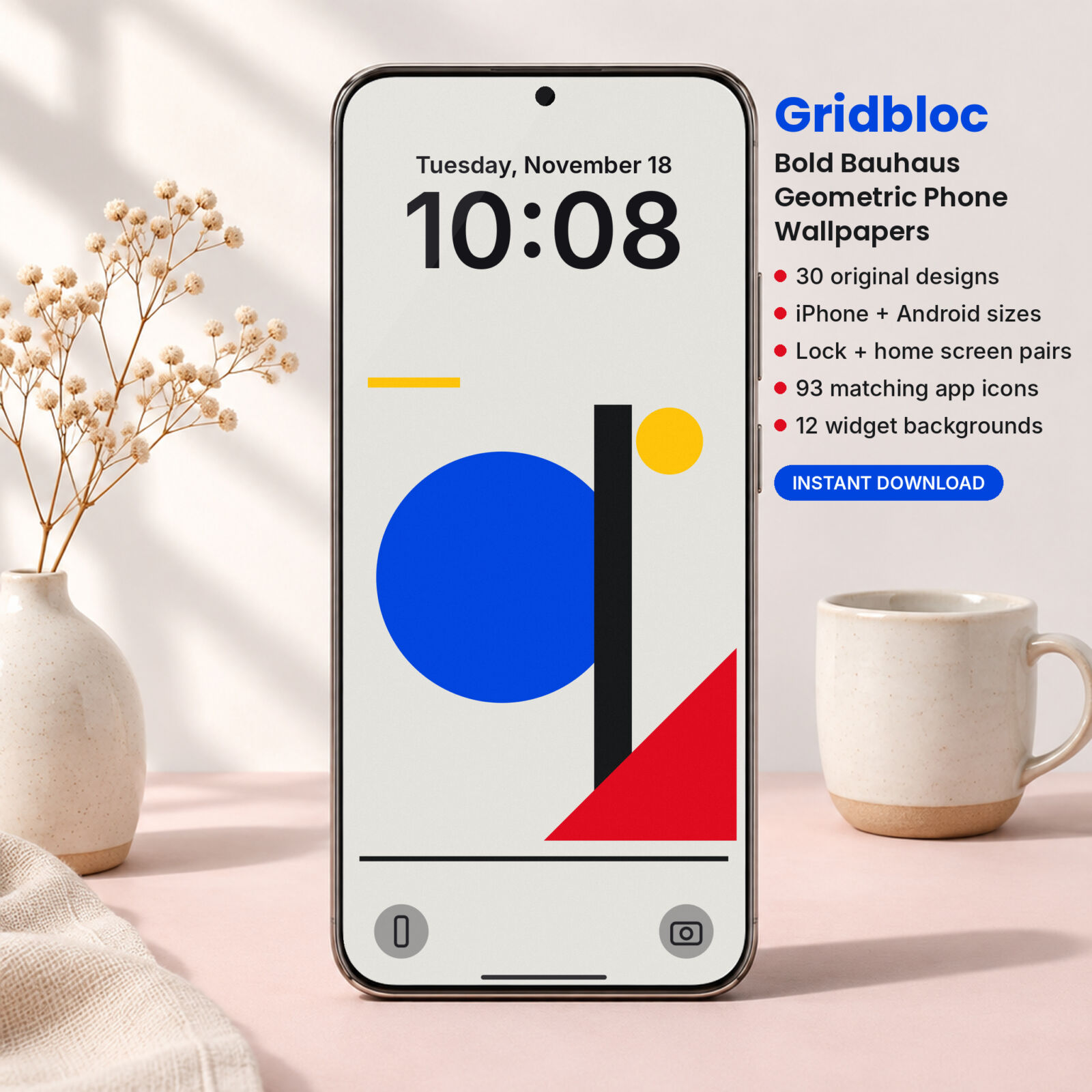
Download 3 free Bauhaus phone wallpapers
The free set comes from our Gridbloc collection: Poster, Quarter Rings and Arch Trio in the Classic colorway (blue, red, yellow and black on chalk). Each design comes in iPhone (1290 x 2796) and Android (1440 x 3200) sizes.
Free Bauhaus Phone Wallpapers (3 Geometric Designs, iPhone + Android)
3 bold Bauhaus wallpapers from the Gridbloc pack (Poster, Quarter Rings and Arch Trio in the Classic colorway), each in iPhone 1290 x 2796 and Android 1440 x 3200 PNG, plus a quick guide to the full 30-design pack.
Want everything unlocked?
The free file is a sample. The full version has every page, tab and feature, plus the user guide.
See the full versionWhat is Bauhaus design?
The Bauhaus was a German art and design school that ran from 1919 to 1933. Its teachers and students believed that good design should be simple, useful and built from basic parts. You see its influence everywhere today, from furniture to fonts to app icons.
Bauhaus graphics share a few clear traits:
- Basic shapes: circles, squares, triangles, half circles and bars.
- Primary colors: red, blue and yellow, often with black and an off-white.
- Flat color: no gradients or shading, just solid areas.
- Strong layout: shapes placed on a grid with clear balance.
Those traits make Bauhaus a great fit for phones. Flat shapes stay crisp at any size, and a tight palette is easy to match with icons.
The problem with bold wallpapers
Here is the catch. The same contrast that makes a Bauhaus poster striking makes app icons hard to see. A red half circle behind a red app icon? Gone. White labels over a chalk background? Barely there.
There are three ways to solve it:
- Keep the art away from the clock and dock. Every Gridbloc design leaves the top quarter and bottom eighth of the screen plain.
- Use a softer version on the home screen. Same design, lower contrast, so icons sit on top cleanly.
- Use icons with solid tiles. A blue tile with a white glyph reads on any background.
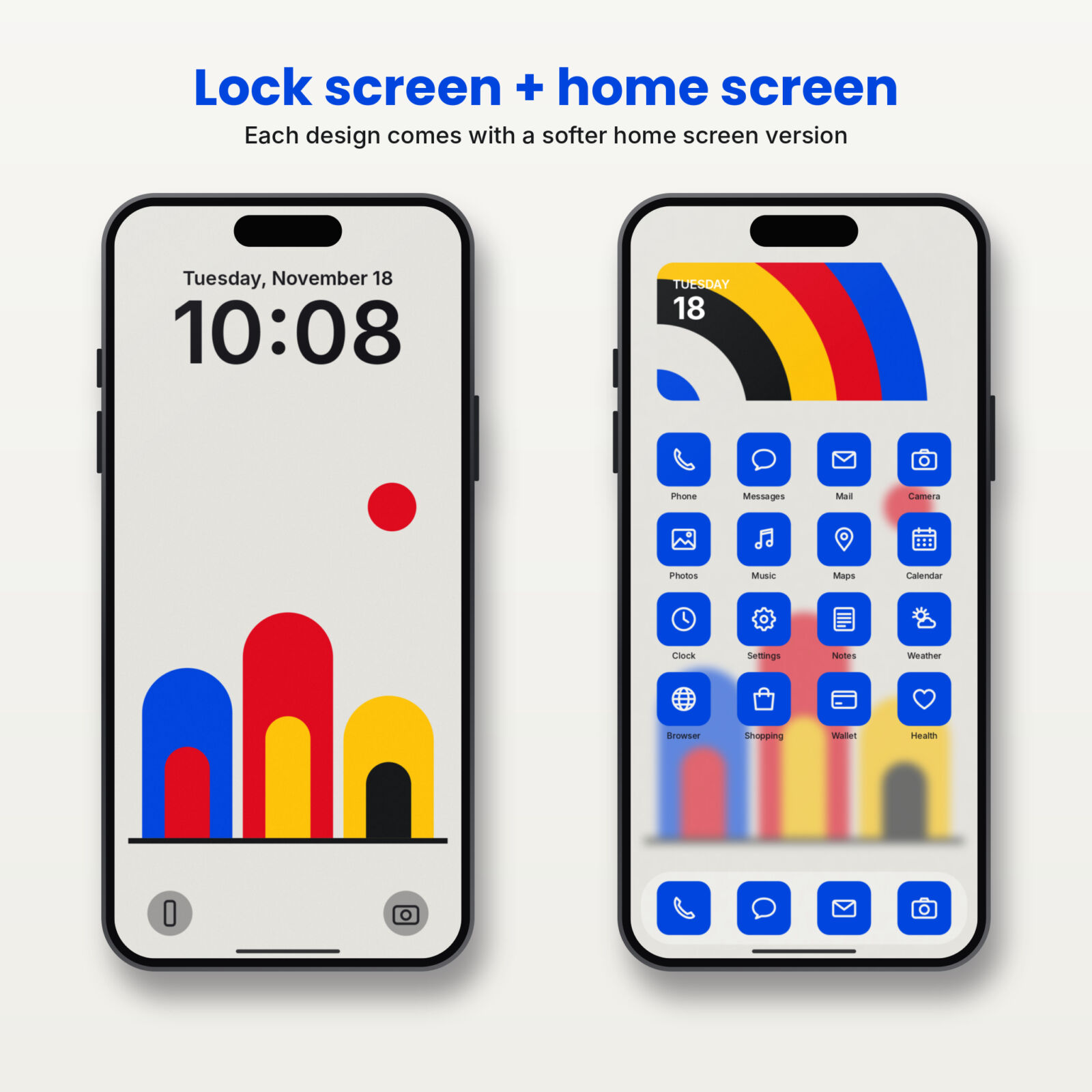
What a home screen version looks like
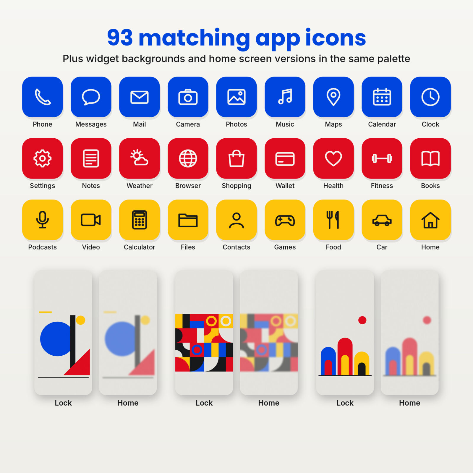
In the full pack, every design has a partner file that is slightly blurred and blended toward the background color. You keep the colors and the composition, but nothing is sharp enough to fight with your icons. Set the full design on the lock screen and its partner on the home screen, and the two read as one look.
Making your own (quick version)
Want to try the idea with the free files? On iPhone, set the wallpaper with Use as Wallpaper, choose Customize Home Screen, and turn on Blur. It isn’t as tuned as a purpose-made home version, but it shows the difference right away.
How to set your free geometric wallpaper
iPhone
- Tap the ZIP in Files to unzip it.
- Open a file from the iPhone folder, tap Share, then Save Image.
- In Photos, tap Share, then Use as Wallpaper, then Add.
- Choose Set as Wallpaper Pair or Customize Home Screen.
Android
- Extract the ZIP in your Files app.
- Open the Android version in Gallery or Photos.
- Tap the menu, then Set as wallpaper.
- Choose Lock screen, Home screen, or both.
Get the full Gridbloc pack
TASKDALE PICK
Gridbloc: Bold Bauhaus Geometric Phone Wallpapers

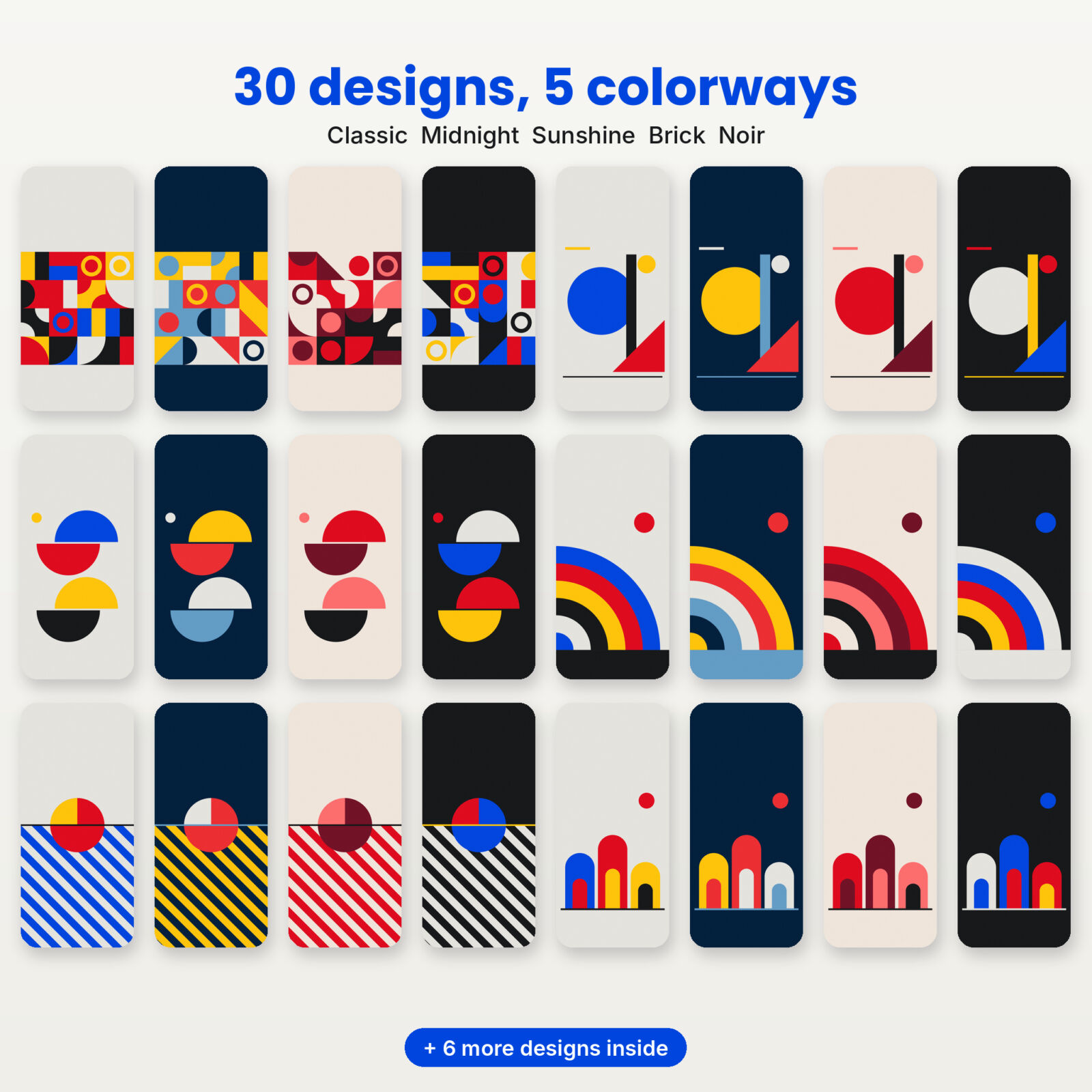
Six compositions (tile grid, poster, semicircle stack, quarter rings, stripe sun and arch trio), each designed so your clock and dock stay clear.
- 30 Bauhaus wallpapers in 5 colorways: Classic, Midnight, Sunshine, Brick, Noir
- A softer home screen version of every design (120 files total)
- 93 app icons in blue, red and yellow tiles
- 12 widget backgrounds
- iPhone + Android sizes and a DOCX guide
One-time purchase, instant download
Free sample vs. full pack
| What you get | Free sample | Full pack |
|---|---|---|
| Wallpaper designs | 3 | 30 |
| iPhone + Android sizes | Yes | Yes |
| Softer home screen versions | No | Yes, all 30 |
| Colorways | 1 or 2 | 5 |
| Matching app icons | No | 93 |
| Widget backgrounds | No | 12 |
| Contact sheet + DOCX guide | Quick card only | Yes |
Choosing a colorway
| Colorway | Background | Best for |
|---|---|---|
| Classic | Chalk gray | The original Bauhaus look, light mode |
| Midnight | Deep navy | Evening use, softer contrast |
| Sunshine | Bright yellow | A cheerful, high energy phone |
| Brick | Warm sand | Reds and corals, a warmer take |
| Noir | Near black | Dark mode and OLED screens |
Styling tips for a geometric phone
- Pick one icon color per screen. Blue icons on a Classic background look sharp; mixing blue, red and yellow tiles on one page looks busy.
- Line icons up in full rows. Geometric art loves a grid. Fill rows of four and avoid half rows.
- Match the clock color. On iPhone, set the lock screen clock to black on light colorways and off-white on Midnight and Noir.
- Use a wide widget as a “bar”. A wide widget background across the top echoes the bars and stripes in the art.
- Rotate colorways. Sunshine on Monday, Noir on Friday night. Same designs, new feel.
Which file should I use on my phone?
The download has an iPhone folder and an Android folder. Both folders hold the same designs. The only difference is the shape of the file, so pick the one closest to your screen.
| Your phone | Folder to use | Why |
|---|---|---|
| iPhone 12 and newer, including Plus and Pro Max | iPhone | Made at 1290 x 2796 (Plus and Pro Max size), so it fits every recent iPhone |
| iPhone SE or older iPhone 8 style models | iPhone | The phone trims a little from the top and bottom; the art in the middle stays whole |
| Samsung Galaxy S and A series, Pixel, Motorola, OnePlus | Android | Made at 1440 x 3200, which matches most tall Android screens |
| Foldables (cover screen) | Android | Tall and narrow, so the Android file fits best |
| Tablets | Either | Works, but the sides will be cropped because the files are phone shaped |
If you are not sure, try the iPhone file first on an iPhone and the Android file first on anything else. You can always switch in a few seconds.
A short guide to Bauhaus color
Bauhaus teachers spent a lot of time on color, and one idea from their classes is still fun to try on a phone: matching basic shapes to basic colors. A common version pairs the triangle with yellow, the square with red and the circle with blue. You can see that thinking in the Classic colorway, where blue circles anchor most designs and red triangles add energy.
The other colorways bend the rules on purpose:
- Midnight swaps the light background for deep navy, so yellow and red glow instead of shout.
- Sunshine uses yellow as the background, which makes black shapes look heavier and more graphic.
- Brick drops blue entirely for reds, corals and near black, a warmer take on the style.
- Noir puts everything on near black, the best choice for dark mode and OLED screens.
Widget ideas for a geometric home screen
- Use a wide widget as a color bar. A wide crop from the Stripe Sun or Tile Grid designs across the top of the screen echoes the bars in Bauhaus posters.
- Square widgets as tiles. Two square widget backgrounds side by side look like two tiles from the grid design.
- Bold numbers. A clock or date widget in a heavy sans serif font in black or white suits the style better than thin or script fonts.
- Keep icons in one color. Blue tiles on Classic, yellow on Midnight, red on Brick. One color makes the grid look intentional.
Five Gridbloc pairings to try
- Poster Classic on the lock screen with its soft home version and blue icons.
- Quarter Rings Midnight with yellow icons for an evening look.
- Arch Trio Sunshine with black icons on yellow tiles.
- Semicircle Stack Brick with red icons for a warm, poster-like phone.
- Tile Grid Noir on the lock screen and Stripe Sun Noir behind your apps for dark mode.
Why flat geometric art looks so crisp on phones
Photos and painterly art have soft detail that phones resize and compress. Flat geometric shapes are different: a circle is a circle at any size. When we draw the designs at the exact size of your screen, every edge lands cleanly on the pixel grid, so curves stay smooth and colors stay solid. That is also why the files are PNG. A JPEG would add faint blocks along the edges of the shapes, which you would notice most on the bright yellow and red areas.
The same flatness makes matching easy. Because each colorway uses only four or five solid colors, you can copy them into a widget app or theme setting and get an exact match.
More from Taskdale for design lovers
| Product | What it is | Link |
|---|---|---|
| Tessaloom Geometric Coloring Book | 60 tessellation and op-art patterns to color, printable PDF | View on Taskdale |
| Inkglow AMOLED Dark Wallpapers | 40 true black designs + 93 glow icons + 12 widgets | View on Taskdale |
| Dunewren Boho Phone Wallpapers | 36 neutral boho designs + 93 icons + 12 widgets | View on Taskdale |
| Mellowmist Pastel Gradient Wallpapers | 24 calm pastel designs + 93 icons + 12 widgets | View on Taskdale |
| Termlight 2027 Digital Student Planner | Hyperlinked iPad planner with grade log and exam planner | View on Taskdale |
Download your free Bauhaus wallpapers
Grab the three Classic designs below. If you want the other 27, the home screen versions and the icons, the full Gridbloc pack has them all.
FAQ
Are these copies of real Bauhaus posters?
No. They are original compositions drawn for Taskdale in the Bauhaus style.
Why are the shapes placed low on the screen?
To keep the clock area clear. Your eyes go to the time first, so the art lives in the middle and lower middle.
Do the wallpapers work in dark mode?
The Midnight and Noir colorways are made for it. Classic, Sunshine and Brick suit light mode.
Will these fit my phone?
The iPhone files are 1290 x 2796 px and the Android files are 1440 x 3200 px.
Can I print them?
They are sized for phone screens and licensed for personal device use, so they are not meant as wall prints.
Do I need an app to use these?
No. Your phone’s own wallpaper settings set them. Custom icons on iPhone use the free Shortcuts app.
Can I use one design on both screens?
Yes. The free designs are calm enough at the top and bottom to work on both screens, especially if you turn on Blur for the home screen on iPhone.
Which colorway is closest to original Bauhaus posters?
Classic: blue, red, yellow and black on an off-white background.