You have outgrown the big, bold pages. A mandala with twelve petals is done before the tea cools, and you want something that takes a whole Sunday afternoon. Advanced coloring books are built for exactly that stage: fine lines, crowded scenes and hundreds of small shapes that reward patience.
This guide is for experienced colorists who already own decent pencils and want pages that push them. You will learn what separates a truly intricate design from a busy one, how to plan a palette for a page with 400 tiny spaces, which techniques suit dense linework, and which four printable books on Taskdale give you the most to work with.
Every pick below is a PDF you print at home. That matters more than it sounds. When a page goes wrong on the third hour, you print a fresh copy and start again with what you learned.
Quick picks for experienced colorists
| Product | Best for | Price | Link |
|---|---|---|---|
| Botanical Gardens: An Intricate Coloring Collection | 50 detailed garden and glasshouse scenes | Original price was: $9.99.$2.99Current price is: $2.99. | View |
| Secret Gardens Coloring Book | Layered walled-garden scenes with hidden details | $3.49 | View |
| Botanical Animals Coloring Book | Fur, feathers and petals woven together | $3.49 | View |
| Hue & Harmony Color by Number for Adults | Advanced numbered pages with 11 to 14 colors | $4.99 | View |
What makes a coloring book advanced
Small spaces alone do not make a page advanced. Plenty of cheap books just shrink a simple drawing and fill the gaps with random swirls. That gives you eye strain, not a challenge. A good intricate page has detail that means something: veins in a leaf, cobbles in a path, scales on a koi.
Here is a quick test. Look at the page from arm’s length. Can you still tell what the scene is? A fountain, a gate, a fox in ferns? If yes, the detail supports the picture. If the whole sheet turns into gray fuzz, the artist has packed lines in for the sake of it, and you will spend three hours coloring noise.
Signs of a well-made intricate page
- A clear focal point. One thing the eye lands on first, like a fountain or a stag’s head.
- Varied shape sizes. Some medium areas for rest, some tiny ones for focus. All-tiny is exhausting.
- Closed shapes. Lines meet, so you know where one color stops and the next begins.
- Dark, clean lines. Gray, fuzzy print makes fine work harder than it needs to be.
- Room for depth. Foreground, middle and background, so shading has somewhere to go.
If you are still deciding whether you are ready for this level, our roundup of adult coloring books for a calm evening covers two intricate picks with gentler entry points.
Planning a palette before the first stroke
Beginners pick up a pencil and start. Experienced colorists spend ten minutes looking first, and that ten minutes saves the page. On a dense botanical scene with 300 or more spaces, random color choices pile up into mud by the halfway mark.
The three-family method
Choose three color families and stick to them. For a rose garden: warm pinks and reds for the blooms, two or three greens for foliage, and a cool gray-blue for stone and sky. Give yourself one wildcard, maybe a soft gold for highlights. That is roughly ten pencils, not sixty.
So why so few? Because repetition is what makes an intricate page look calm. When the same three greens show up across every leaf, the eye reads the page as one garden instead of 200 separate leaves.
Use a swatch strip
Before you commit, color a small strip of each pencil on scrap paper from the same printer. Pencils look different on the barrel than on the page. A ‘sage’ that turns out minty can throw a whole autumn scene off, and it is far better to find that out on a scrap than on the twentieth leaf.
Intricate garden scenes worth your best pencils
Gardens are the classic choice for detailed coloring, and for good reason. Leaves, petals, stone and water each need a different touch, so one page becomes a full workout of technique. The best garden books also give every scene a structure, a path or arch that pulls your eye through.
Botanical Gardens is the largest set here. It has 50 scenes, from a fern house and an orchid conservatory to a garden labyrinth, a bonsai exhibition and a dewy spider web. Many pages are built around one strong focal point, which makes palette planning far easier.
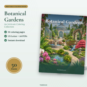
Botanical Gardens Coloring Collection
Price: Original price was: $9.99.$2.99Current price is: $2.99. | Best for: experienced colorists who love gardens
You get 50 detailed garden scenes in separate US Letter and A4 PDFs, plus a coloring tips page, a color test page and a printing guide in Word format. Each scene sits in a thin frame with its title below, and the lines were cleaned up to print sharp and dark. Start with the Rose Garden Fountain: color the fountain first, then let the roses and path follow its palette.
If you like your gardens with more mystery, look at the walled scenes in Secret Gardens. It has 32 pages such as a moonlit glasshouse, a wisteria archway, a hedge maze seen from above and a hedgehog herb garden, with small treasures tucked into the foliage. Those hidden details are a nice reward on the second or third sitting, when you finally reach the corner where a tiny creature has been waiting.
Techniques that suit dense linework
Intricate pages punish heavy hands. Press hard in a small space and you flatten the paper tooth, so the next layer slides right off. The fix is simple: go light, go often.
Layering in three passes
- Base pass. Light pressure, mid-tone color, every space in that family. Think of it as a map of where color goes.
- Shadow pass. A darker shade of the same family on the side of each shape away from your light source. Pick one light direction, say top left, and keep it for the whole page.
- Glow pass. A pale yellow, cream or white pencil over the lit edges to blend and lift them.
Three passes on a single leaf takes about a minute. Across 150 leaves that adds up, which is exactly why these books last for weeks. And when you step back after the shadow pass and the garden suddenly has depth, that is the moment that makes it worth it.
Tools that help on small spaces
- Keep pencils sharp. A small handheld sharpener at your elbow beats a trip to the desk.
- Fine-tip markers (0.4 mm or so) are good for tiny backgrounds, but test them first on printer paper so you know how much they bleed.
- A white gel pen adds sparkle to water drops and dew on a spider web after you finish.
- A desk lamp angled from the side shows up missed spaces better than overhead light.
When animals and plants share the page
Some colorists find pure botanical pages a bit samey after a while. Thirty roses in, you want a face to look back at you. That is where mixed scenes help: an animal gives the page its focal point, and the plants around it give you the fine detail.
The challenge goes up, too. You are now switching between textures. Fur wants short strokes in the direction of growth. Feathers want long, curved ones. Petals want smooth, even layers. Moving between all three on one page keeps your hand and your attention busy in the best way.
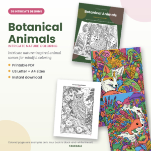
Botanical Animals Coloring Book
Price: $3.49 | Best for: colorists who want texture variety
This book has 36 detailed scenes where creatures and plants grow together: a fern fox, an owl among moonflowers, a stag in wildflowers, a koi among chrysanthemums and a chameleon on a vine. It comes as separate US Letter and A4 PDFs, and pencils, pens or markers all work on the pages. Try the Owl and Moonflowers page first, because the feathers and petals make a good contrast study.
A practical tip for these pages: color the animal last. Finish the plants around it so you know the full background palette, then pick fur or feather colors that stand out from it. A rust-orange fox glows against cool blue-greens. Against warm autumn leaves, it disappears.
Advanced color by number for when you want a break from choosing
Even experienced colorists get decision fatigue. After a long week, picking 14 shades for a coral reef can feel like homework. Advanced color by number keeps the challenge of small spaces and long sessions but hands the palette decisions to someone else.
It is also a quiet way to learn. Working through a planned palette shows you how a designer pairs colors, where the darks sit and how highlights are spread. Plenty of skilled colorists come back to their freehand pages with sharper choices after a few numbered ones.

Hue and Harmony Color by Number
Price: $4.99 | Best for: skilled colorists wanting a guided session
Hue and Harmony has 30 designs across three levels, and the ten Advanced pages use 11 to 14 colors with small areas, including a golden lion, a jewel mandala, a coral reef and a hilltop village. Every page has a color key with named swatches, and a Finished Gallery at the back shows each design in full color. Print the Swatch Chart first and match your own pencils to it before you start.
You do not have to start at Advanced. If you are new to numbered pages, a Medium design like the koi pond is a good warm-up for learning how the key works, and it still takes a solid hour.
Printing intricate pages so the detail survives
Fine lines are the first thing a careless print setting ruins. A page scaled to 94% or printed in draft mode can turn crisp leaf veins into broken dots. Get the settings right once and every page after that is easy.
- Print at 100% or actual size. Turn off any ‘fit to page’ option. These books come in separate Letter and A4 files, so pick the one that matches your paper.
- Use normal or high quality. Draft mode saves ink but fades thin lines.
- Choose heavier paper. Plain 20 lb printer paper is fine for one or two pencil layers. For layering in three passes, a 28 to 32 lb paper or light cardstock takes pressure without pilling.
- Print one test page. Check that the smallest shapes are still closed and the lines are black, not gray.
- Print two copies of a favorite. One to test a palette, one for the final version.
That second copy is one of the quiet advantages of printables over bound books. You can try a moody night palette on the moonlit glasshouse, then a bright spring one, and keep both.
Common mistakes on advanced pages
Starting in the top corner
Most people start top left and work across, like reading. On a detailed page that often means you finish the background before deciding on the focal point. Start with the main subject instead, then work outward.
Using every pencil in the tin
A 72-pencil set tempts you to use all 72. Resist. The pages that look most finished almost always use fewer than fifteen colors with lots of shading.
Leaving no white
Not every space needs color. A few untouched spots on water, glass or a petal edge read as light. Fill them all and the page goes flat.
Rushing to finish
An intricate page might take six to ten hours across a week. That is the point. Spread it over several evenings, about 45 minutes at a time, and your hand stays steady. For more on making coloring a calm routine rather than a race, our guide to coloring for relaxation and stress relief has a few simple habits.
Who these books are not for
Be honest with yourself here. Advanced coloring books are not a good first book. Someone who has never colored as an adult often feels defeated by page two, staring at 500 spaces with no idea where to begin. Start with bold pages, build some confidence, then step up.
They are also a poor fit for anyone with shaky hands, tired eyes or limited time. A 15-minute lunch break will barely cover one corner of a garden scene. If that is your situation, a larger-print book will give you the satisfaction of finishing something, and that feeling counts for a lot. And for young kids, these pages are simply too fine; a 7-year-old will be happier with big shapes and a fat crayon.
Frequently asked questions
What is the hardest type of coloring book?
Pages with very small, closed spaces and layered scenes are the hardest, especially detailed gardens and mixed animal and plant scenes. Advanced color by number pages with 11 or more colors are hard in a different way, because accuracy matters more than creative choice.
Are colored pencils or markers better for intricate coloring?
Colored pencils are usually better because you can layer and shade in tiny spaces. Fine-tip markers work well for small solid backgrounds. Many experienced colorists use pencils for the main work and a fine marker or gel pen for accents.
How long does one intricate coloring page take?
Expect anywhere from three to ten hours for a full detailed scene, depending on how much you shade. Spread across a week of evening sessions, one page makes a satisfying project.
What paper should I print detailed coloring pages on?
A heavier paper around 28 to 32 lb, or light cardstock, holds up best to layered pencil. Standard printer paper works for lighter coloring or a test run of your palette.
Can beginners use advanced coloring books?
They can, but most enjoy it more after a few simpler books. If you want to try, pick a page with a clear focal point and a few larger areas, and limit yourself to about ten pencils.
Your next step
Pick one scene tonight, not a whole book’s worth of plans. Print the Rose Garden Fountain from Botanical Gardens: An Intricate Coloring Collection, choose three color families and one wildcard, and color only the fountain in your first session. Seeing that one centerpiece glow is the best way to start a long, absorbing page.