Pastels have a reputation problem. Pick the wrong ones and your kawaii page looks faded, like it sat in a sunny window for a year. Pick the right ones and layer them properly, and the same page looks like a sweet shop: soft, bright and impossible not to smile at.
This guide shows you how to color a kawaii coloring book with bright pastel palettes, step by step. It is written for teens and adults who love cute art, and for parents coloring alongside kids. You get five palettes you can copy, a layering method that stops pastels looking chalky, how to do blush and shine, what to do with backgrounds, and fixes for the most common pastel mistakes. We also point to a few printable Taskdale books that suit the style, including one with ready-made coded palettes.
Quick picks for pastel coloring practice
| Product | Best for | Price | Link |
|---|---|---|---|
| Ink & Glint Manga Coloring Book | Coded palettes, blush and hair shine guides | $4.99 | View |
| Friendship Fun Coloring Book | Sweet scenes for pastel practice | $2.99 | View |
| Indoor Activities Coloring Book Adventure | Tea parties, forts and cozy rooms | $2.99 | View |
Bright pastels versus dusty pastels
Not all pastels are the same. This is the single most useful thing to understand before you start.
Bright pastels are pure colors mixed with white. Think bubblegum pink, mint, lemon, baby blue and lilac. They feel clean and cheerful. This is what most kawaii art uses.
Dusty pastels are colors mixed with white and a touch of gray or brown. Dusty rose, sage, oatmeal, slate blue. They feel calm and vintage. Lovely for cozy cottage pages, but they can make a kawaii page look tired.
Here is the test. Hold a pencil next to a sheet of white paper. If the color looks clean and fresh, it is a bright pastel. If it looks a little muted or misty, it is dusty. For kawaii, start with the bright ones and keep the dusty ones for backgrounds or shadows.
Five bright pastel palettes to copy
Each palette has five colors: three main colors, one accent and one shadow tone. Write them on a sticky note and keep it beside your page.
1. Strawberry milk
Baby pink, cream, soft red, mint accent, and a lilac-pink for shadows. Perfect for desserts, bunnies and anything with frosting.
2. Sea glass
Mint, aqua, baby blue, lemon accent, and a soft periwinkle for shadows. Great for ocean animals, bath time and rainy-day pages.
3. Lemon sherbet
Lemon yellow, peach, cream, sky blue accent, and a warm apricot for shadows. Sunny, friendly, ideal for chicks, flowers and breakfast scenes.
4. Unicorn dream
Lilac, pink, baby blue, mint accent, and lavender-gray for shadows. Use it for fantasy, stars, clouds and anything magical.
5. Candy shop
Bubblegum pink, lemon, aqua, coral accent, and soft purple for shadows. The loudest of the five. Use it when you want a page to pop from across the room.
The shadow color in each set matters more than it looks. A pastel page shaded with gray goes flat and dull. Shaded with a pastel that is just a little cooler or deeper, it stays bright all the way into the corners.
Books with palettes already worked out
If choosing colors is the part that slows you down, a book with coded palettes takes that decision away. You match the named roles to your own pencils or markers and start coloring.
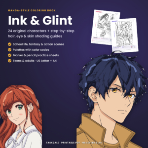
Ink and Glint Manga Coloring Book
Price: $4.99 | Best for: teens and adults learning shading
This book has 24 original anime-style characters with profiles, plus six shading guides covering hair highlights, sparkly eyes and skin tones with base, shadow and blush. There are 42 coded palette sets, including eight fantasy hair palettes with light, base, shadow and deep tones. Practice sheets for expressions, eyes and hairstyles are included, so try a pastel fantasy hair palette on the hair practice sheet before your first character page.
The blush and hair shine guides are exactly what kawaii coloring needs. Blush is the signature of the style, and shiny hair in pastel pink or lilac is one of its prettiest effects.
A 20-minute pastel warm-up
Before you touch a page you care about, spend twenty minutes on scrap paper. It saves you from discovering halfway through a character that your mint looks like toothpaste.
- Swatch every pastel you own. Draw a row of small boxes and fill each with one color at light pressure, then a second box at medium pressure. Label them. You will be surprised how different some look on paper compared with the pencil barrel.
- Test your shadow pairs. Next to each main pastel, try two possible shadow colors. Circle the pair that still looks bright.
- Try white burnishing. Pick three swatches and press white over half of each. Compare the halves. That is the effect you are aiming for on the real page.
- Practice one blush oval. Draw a simple circle face with two dot eyes and add blush. Do it three times with different pressures.
Keep the swatch sheet in the front of your folder. Next time you pick a palette, you can see the real colors in seconds, and the small thrill of a page that comes out exactly as planned is worth those twenty minutes.
The layering method that makes pastels glow
Pastel pencils are pale by nature. One quick layer looks streaky and thin. These steps give you smooth, bright color with no white flecks of paper showing through.
- Start with a white or cream base. Color the whole shape in white or cream with light pressure. It fills the paper grain so the pastel sits on top evenly.
- Add your main pastel, light. Small circles, not long strokes. Circles leave fewer lines.
- Add a second layer of the same color. Slightly more pressure. Now the color is even.
- Shade with your shadow tone. Only along one side and under things. Leave most of the shape in the main pastel.
- Burnish with white. Press firmly with a white pencil over the whole shape. The layers blend and the surface goes almost glossy.
It takes a little longer than one layer, but the difference is huge. A strawberry colored this way looks like it would be soft to touch.
If you use markers
Pastel markers are great for flat, even color in large areas. Color in one direction, work fast so the edge stays wet, and let each section dry before you add the next. Then add shadows and blush with pencils on top. Mixing tools like this gives you smooth bases and soft details.
Blush, shine and the little details
These finishing touches are what make a page read as kawaii, rather than just pale.
Blush
Use a pink one shade deeper than the face color. Color a small oval under each eye with very light pressure, then soften the edges with white. Coral works well on peach or cream faces. On a pink character, try a deeper rose.
Eye shine
Leave a small white dot in each eye, or add one at the end with a white gel pen. Two dots, one big and one tiny, look extra sparkly.
Highlights on objects
A short white curve on the top of a cherry, the side of a jar or the rim of a cup makes things look shiny. Add these last, after all the color is down.
Tiny decorations
Little stars, hearts and sparkle marks around a character are part of the kawaii look. Draw them with a fine pen or a gel pen in a contrasting pastel.
Sweet scenes for pastel practice
You do not need a dedicated kawaii book to practice pastels. Any page with friendly characters and soft scenes works well, especially ones with clothes, picnics, umbrellas and flowers to fill.
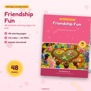
Friendship Fun Coloring Book
Price: $2.99 | Best for: pastel practice for kids and teens
This book has 48 scenes of friends doing things together, such as a picnic under a big tree, a giggle swing, an umbrella puddle splash and a hot air balloon ride. Each page has big shapes for quick wins and small details like patterned dresses and flower borders. Print the Umbrella Puddle Splash page and try the Sea Glass palette on the umbrellas and raincoats.
Scenes with two or three characters are good for trying palettes side by side. Give each friend a different palette from the list above and see which one you like best.
Backgrounds that keep pastels bright
The background can make or break a pastel page. Leave it blank and the page can look unfinished. Fill it with a dark color and the pastels look washed out by comparison.
- Soft gradient. Pink at the bottom fading to lilac at the top. Simple, dreamy and quick with two pencils.
- Polka dots. Tiny dots in two pastels on a white background. Very kawaii and easy to do while watching TV.
- Stripes. Light candy stripes behind a character look like wrapping paper.
- Sparkle field. White background with little stars and hearts scattered across it.
- One flat pastel. A single even color, slightly lighter than the main character’s colors.
A rule that almost always works: the background should be lighter or simpler than the character. That keeps the eye on the cute thing in the middle.
Using one bright accent
A page made of only pastels can look a little sleepy. The trick bright kawaii artists use is one strong accent color, used in small doses. A red cherry on a pastel cake. A hot pink bow on a mint bunny. A tiny navy outline around the eyes.
Pick one accent per page and use it in three small places. That repetition looks planned, and the strong color makes the pastels around it look even softer and brighter. Coral, hot pink, cherry red and deep teal all work well as accents.
Cozy rooms in pastel
Indoor scenes are a lovely way to practice pastels across lots of objects at once: cushions, rugs, mugs, curtains, toys. Each one is a small shape that takes a palette well.
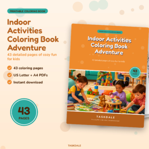
Indoor Activities Coloring Book Adventure
Price: $2.99 | Best for: cozy room scenes for all ages
This book has 43 detailed scenes of things kids do at home, including a tea party, a reading nook, a castle blanket fort and a toy kitchen. Patterned rugs, shelves, mugs and plants give you dozens of small shapes to fill. Try the Tea Party page in Strawberry Milk with a single cherry red accent on the teapot.
Room scenes also let you practice the background rule. Keep walls in a pale cream or very light pastel, and save the stronger colors for cushions and toys.
Common pastel mistakes and quick fixes
- Streaky color. Fix: add a white burnishing layer, pressing firmly in small circles.
- Washed-out page. Fix: add one bright accent in three small places, and deepen the shadow tone slightly.
- Muddy shadows. Fix: you probably used gray or brown. Switch to a cooler pastel like lavender or periwinkle.
- Too many colors. Fix: stick to one five-color palette per page. Kawaii looks best when colors repeat.
- Blush looks like a rash. Fix: lighter pressure, smaller oval, and soften the edge with white.
- Waxy surface, no more color will stick. Fix: you pressed too hard too early. Next time, keep the first two layers light.
Tools worth having
You can color kawaii pages with any set of pencils, but a few tools make bright pastels much easier.
- A set with plenty of light colors: pinks, mints, lilacs, light blues and creams.
- A good white pencil for bases and burnishing.
- A white gel pen for shine dots and sparkles.
- A fine black or dark brown pen for touching up faces.
- Slightly heavier, smooth paper. Around 28 to 32 lb takes many layers without pilling.
If you love pastel stationery as much as pastel coloring, our look at cute daily planners with pastel pages and rainbow days is a nice next stop. And for more on the kawaii style itself, see our guide to cute coloring books with kawaii animals and sweet food characters.
Frequently asked questions
What colors are used in kawaii coloring?
Mostly bright pastels: baby pink, mint, lemon, baby blue, lilac and peach. One stronger accent like coral or cherry red adds pop.
How do I make pastel colored pencils look brighter?
Layer them over a white base, add a second layer of the same color, and burnish with white. Use a pastel shadow color instead of gray.
Should I use markers or pencils for kawaii pages?
Both work. Markers give flat, even color in big areas. Pencils are better for blush, shading and soft details.
How do I color blush on a kawaii character?
Use a pink one shade deeper than the face. Color a small oval under each eye with light pressure and soften the edges with white.
What background works best with pastel colors?
Something lighter or simpler than the character: a soft gradient, polka dots, stripes or a single pale color.
Can kids use these pastel techniques?
Yes. Kids from about eight can follow the layering steps. Younger children enjoy choosing a palette from a sticky note and adding sparkles.
Your next step
Write one of the five palettes on a sticky note, print a page with a sweet character, and color it with the white-base layering method. If you want palettes and shading guides done for you, start with the hair practice sheet in the Ink and Glint Manga Coloring Book.