A CV with good content can still lose the reader in the first two seconds if the page looks cramped, shouty or messy. Styling is not decoration. It is how the reader finds your job titles, dates and results without effort.
This guide covers the CV styling basics that matter: which fonts to pick, what sizes to set, how much spacing a page needs, and how to use colour without making a mess. It suits anyone formatting a CV in Word or Google Docs, whether you are building from scratch or fixing a template that has drifted out of shape after a few edits.
By the end you will have a short set of numbers you can apply in about thirty minutes, plus a few template kits that already have the styling done, if you would rather spend the time on your wording.
Quick picks: template kits with the styling already set
| Product | Best for | Price | Link |
|---|---|---|---|
| Hollis Resume Kit | No font installs, warm colourways | $8.99 | View |
| Marlowe Resume Kit | Classic serif name with soft accents | $4.79 | View |
| Sloane Resume Kit | Modern layout built on real Word styles | $4.49 | View |
Choosing a font that reads well
Pick a font the reader will not notice. That sounds odd, but it is the goal. If someone comments on your font, it is probably getting in the way.
Safe choices
Sans serif fonts such as Calibri, Arial, Lato and Montserrat look clean on screens. Serif fonts such as Cambria, Georgia and Garamond feel a little more traditional and print beautifully. Both families work. A law firm or a university might lean towards a serif. A tech start-up or a design agency might suit a sans serif. Neither choice will cost you an interview on its own.
One font or two?
One font in two weights (regular and bold) is the simplest route and very hard to get wrong. If you want a little more character, pair a serif for your name and section headings with a sans serif for the body text. Two fonts is the limit. Three starts to look like a ransom note.
Watch out for missing fonts
Here is a trap many people fall into. You choose a lovely font, send the Word file, and the recruiter’s computer does not have it installed. Word swaps in something else, your lines shift, and page one now spills onto page two. The fix is simple: send a PDF, or use a font that is built into Word and Google Docs, or embed the fonts in the file.
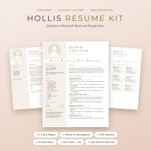
Hollis Resume Kit
Price: $8.99 | Best for: anyone tired of broken fonts
Hollis has Montserrat and Lato built into every Word file, so the layout looks right the moment you open it, and Google Docs already has both. You get resumes with a photo or a monogram in 1, 2 and 3 pages, a single-column ATS version, cover letters, references and a thank-you letter, in Champagne, Rosewood and Graphite and both US Letter and A4. Open the colourway you like, type over the sample text, and export to PDF before you send.
Font sizes that create a clear order
Size tells the reader what matters most. Your name is biggest, section headings come next, job titles after that, and body text last. If everything is the same size, nothing stands out. If too many things are big, the page shouts.
| Element | Suggested size | Weight |
|---|---|---|
| Your name | 20 to 28 pt | Bold or a light serif in capitals |
| Title line under your name | 11 to 13 pt | Regular, often in your accent colour |
| Section headings | 12 to 14 pt | Bold or small capitals |
| Job title and employer | 10.5 to 12 pt | Bold for the title, regular for the employer |
| Body text and bullets | 10 to 11.5 pt | Regular |
| Dates and locations | 9.5 to 11 pt | Regular or italic, sometimes grey |
Never drop body text below 10 point to squeeze in an extra bullet. A tiny font is the clearest sign that a page holds too much. Cut a weaker bullet instead. Your reader, possibly scrolling on a laptop at the end of a long day, will thank you without knowing it.
Spacing and margins: the quiet part of CV styling
White space is what makes a page feel calm. Most cramped CVs have perfectly good fonts. They just have no room to breathe.
Margins
Aim for margins between 1.8 cm and 2.5 cm, or roughly 0.7 to 1 inch. Going narrower than 1.5 cm makes the text run almost to the paper’s edge, which looks crowded and can get clipped on some printers.
Line spacing
Single spacing or 1.15 works for body text. Double spacing wastes half the page. Inside a bullet list, a small gap after each bullet (around 2 to 4 pt) is easier to scan than a solid block.
Space around headings
Give each section heading more space above it than below it, something like 12 pt before and 4 pt after. That simple rule ties each heading to its own content and separates it from the section before. It is the single most useful spacing setting on a CV.
A worked example
Picture a two-page CV for an operations coordinator. Margins of 1.2 cm, 9 pt Arial, no space between sections. It fits, technically. Now change the margins to 2 cm, set body text to 10.5 pt, add 12 pt above each heading, and cut two old roles down to one line each. The CV still fits on two pages. It also looks like someone took care, which is exactly the impression you want before a reader has seen a single word.
Adding colour without overdoing it
Colour is optional. A black and dark grey CV is perfectly professional. But one well-chosen accent colour can make a page feel finished and help the eye find the headings.
The one-accent rule
Pick one accent colour and use it in two or three places at most: your name or title line, section headings, and perhaps thin divider lines. Body text stays dark grey or black. That is it for colour. A CV with four colours looks like a menu.
Choosing the shade
Muted colours are easier to live with: navy, slate, sage, deep teal, taupe, a soft burgundy. Very bright reds, yellows and lime greens are hard to read and can look loud on a printout. Pale text on a white page is the worst offender, because it disappears on some screens.
The greyscale test
Print your CV in black and white, or switch your PDF viewer to greyscale. If the headings vanish into the body text, your accent colour is too light. Many recruiters still print a shortlist, and plenty of office printers are mono.
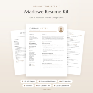
Marlowe Resume Kit
Price: $4.79 | Best for: soft colour with a classic feel
Marlowe pairs a wide-spaced serif name with soft accents in three colourways, Sand, Sage and Slate, each in US Letter and A4. The kit covers 1, 2 and 3 page resumes with and without a photo, an ATS version, a cover letter, references page and thank-you letter, plus the free Marcellus and Montserrat fonts with their licences. Try the Slate version first if you are unsure, since it prints most cleanly on a mono office printer.
Alignment and lining things up
Neat alignment is a small detail that people feel more than see. When dates line up down the right edge and every bullet starts in the same place, the page looks organised. When they wander, it looks rushed.
- Left-align body text. Justified text creates odd gaps between words, especially in narrow columns.
- Use a right tab stop for dates. Pressing the space bar twenty times to push a date to the right never lines up exactly. A tab stop does.
- Keep one bullet style. A small round dot or a short dash, the same size and indent everywhere.
- Use one date format. “Jan 2023 to Present” on every role, not a mix of “01/23” and “January 2023”.
If you build your CV in Google Docs, our step-by-step guide to making a resume in Google Docs shows where the tab stops and indent controls live.
Using styles so changes take seconds
Word and Google Docs both have a feature that most people ignore: named styles. Heading 1, Heading 2, Normal text and so on. When each part of your CV uses a style, changing it once changes it everywhere.
Here is why that matters. Say you decide your section headings should be navy instead of black. If you formatted each heading by hand, that is eight separate edits and you will probably miss one. If they all use one heading style, you change the style and every heading updates in a second. Same for font size, spacing above headings and bullet indents.
To set this up yourself, format one heading the way you want it, right-click the matching style and choose the option to update it to match your selection. Then apply that style to every other heading. It takes ten minutes and saves a lot of fiddling later, especially when you tailor the CV for different jobs.
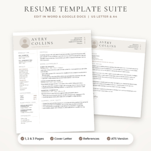
Sloane Resume Kit
Price: $4.49 | Best for: people who restyle often
Sloane is built from simple tables and real Word styles, so adding a job grows the column and deleting a section pulls everything up neatly. The kit includes 1 page resumes with and without a photo, a 2 page resume, a 3 page CV, an ATS resume, a cover letter and references page, each in three colours and both paper sizes. Change one heading style to your preferred accent and the whole document follows.
Styling for online portals and print
Your CV may be read in three ways: by screening software, on a screen and on paper. Styling choices affect all three.
For online portals, keep a plainer version: one column, standard headings such as “Work Experience” and “Education”, no text inside images, and no important details in the header or footer. Some screening systems skip those areas entirely. A photo is usually unnecessary here too. If you are unsure whether to include one at all, our guide on whether to use a resume with a photo or without covers it country by country.
For email and print, your designed version is ideal. Always send it as a PDF so fonts, spacing and colour arrive exactly as you set them. Name the file clearly, such as “Priya-Shah-CV.pdf”.
Styling mistakes to avoid
- Too many fonts. Stick to one, or two at most.
- Bold everywhere. If half the page is bold, nothing stands out. Save it for job titles and key numbers.
- Underlining for emphasis. Readers expect underlined text to be a link.
- Floating text boxes. They jump around when you edit and often confuse screening software.
- Icons for every line. A few contact icons are fine. A skill bar with five stars for “Excel” tells the reader very little.
- Pale grey body text. It looks elegant on a bright monitor and nearly invisible on a laptop in sunlight.
Frequently asked questions
What is the best font size for a CV?
Body text between 10 and 11.5 point works for most fonts, with section headings at 12 to 14 point and your name between 20 and 28 point. Calibri and Arial read well at 10.5 or 11. Never go below 10 point to fit more in.
Is it okay to use colour on a CV?
Yes, in moderation. One muted accent colour for your name, headings and dividers looks professional. Keep body text dark, and check the page still reads clearly when printed in black and white.
Should a CV use a serif or sans serif font?
Either works. Sans serif fonts such as Calibri and Lato feel modern and read well on screens. Serif fonts such as Georgia and Cambria feel classic and print well. Choose the one that suits your field and use it consistently.
What margins should a CV have?
Between 1.8 cm and 2.5 cm, or roughly 0.7 to 1 inch, on all sides. Narrower margins make the page look crowded and may clip on some printers.
How do I stop my CV layout from breaking when I edit it?
Avoid floating text boxes, use named styles for headings and body text, line dates up with tab stops rather than spaces, and send the finished version as a PDF so it looks the same on every screen.
Your next step
Open your CV, set the margins to 2 cm and add 12 pt of space above every section heading. Those two changes alone will make the page feel calmer. If you would rather start from a page where the fonts are already embedded and the styles are set, try the Hollis Resume Kit.