A one-page CV forces you to choose. Every line has to earn its place, and that pressure tends to produce a sharper document than a loose two-pager ever does. Readers notice. A tight page says you know what matters.
This guide is for graduates, early and mid-career applicants, career changers and anyone applying for roles where a quick read is the norm: retail, hospitality, admin, sales, junior tech and most internships. You will get a space budget for each section, a cutting order that keeps the good stuff, bullet examples that hit hard in one line, and a few template kits with one-page layouts already built.
The goal is not to cram. It is to leave out the right things, so what stays reads clearly in the short time a recruiter gives it.
Quick picks: templates with strong one-page layouts
| Product | Best for | Price | Link |
|---|---|---|---|
| Ashford Resume Template Bundle | A polished one-pager plus a portal version | $7.99 | View |
| Sloane Resume Kit | One page with or without a photo | $4.49 | View |
| Marlowe Resume Kit | Minimal one-pager with a matching letter | $4.79 | View |
Who a one-page CV suits
One page works best when your relevant experience fits there honestly. That covers more people than you might think.
- Graduates and school leavers with a degree, a few part-time jobs and a project or two.
- People with under ten years of experience in one field, especially if the early roles were short.
- Career changers who only need to show the parts of their past that point at the new job.
- Shift and service roles such as retail, hospitality, warehouse and front desk, where managers want to see availability and reliability fast.
- Networking and job fairs, where a single sheet is easy to hand over and easy to read standing up.
It is a poorer fit for academic posts, senior leaders with fifteen years of results to show, and some public sector applications that ask for detailed histories. If you are unsure, our comparison of one, two and three page resumes sets out the trade-offs for each length.
A space budget for every section
A typical A4 page at sensible margins and a 10.5 point font holds about 45 to 50 lines of text. Think of those lines as a budget and spend them on purpose.
| Section | Lines | Notes |
|---|---|---|
| Name, title line and contacts | 4 to 5 | Phone, email, town, one link |
| Profile | 3 to 4 | About 40 words |
| Latest or most relevant role | 8 to 10 | Job line plus 4 or 5 bullets |
| Second role | 6 to 7 | Job line plus 3 bullets |
| Older roles | 3 to 5 | One or two bullets each, or a single summary line |
| Education | 3 to 4 | Highest qualification first |
| Skills | 3 to 4 | Tools and named skills, comma separated |
| Headings and spacing | 8 to 10 | Do not skimp here |
Notice where most of the space goes: your two most relevant roles. That is deliberate. A reader decides on those, so they get the room. Everything else is support.
A two-column layout changes the maths slightly. Contacts, education and skills move into a narrow sidebar, which frees the main column for experience. On one page that can give you three or four extra bullets, which is a real gain.
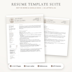
Sloane Resume Kit
Price: $4.49 | Best for: graduates and early career applicants
Sloane has two one-page layouts: one with a round photo frame and one without for US, Canadian and UK applications. A slim left column holds education, skills and languages, so the wider right column is free for experience. The kit also includes a 2 page resume, a 3 page CV, an ATS version, a cover letter and references page, in three colours and both US Letter and A4. Fill in the no-photo one-pager first if you are applying in the UK.
Cutting to one page without shrinking the font
Shrinking the font and margins until everything fits is the most common trick, and the most obvious. Readers can tell. Cut words instead, in this order:
- Delete “References available on request” and any line that repeats your name.
- Remove your street address. Town and region are enough.
- Collapse old roles into one line: “Earlier roles in hospitality and retail, 2015 to 2018.”
- Trim school details to one line once you have a degree or a few years of work.
- Merge similar bullets. “Answered calls” and “handled complaints” become one bullet about resolving customer issues.
- Drop the hobbies section unless it says something useful about you.
- Cut duty bullets that do not show a result.
- Shorten every bullet to two lines at most, ideally one.
A worked example
Take a marketing coordinator with five years of experience and a CV that runs to a page and a half. Her street address and “references on request” go first, saving two lines. Two early jobs at a café and a call centre become one summary line, saving six. Her school results shrink to one line, saving three. Seven bullets in her current role become five by merging the ones about social media posts. One hobbies line goes. She is now on one page, still at 10.5 point, with 2 cm margins. Her best result, growing an email list from 4,000 to 11,000 subscribers in a year, now sits in the top third where nobody can miss it. That feels good.
Bullets that land in one line
A punchy bullet does three things fast: it starts with a strong verb, it says what you did, and it ends with what changed. On a one-page CV, try to do all three in a single line.
- Cut weekly stock waste by 20% by moving the order day from Friday to Monday.
- Booked 30 to 40 client appointments a day across three clinic diaries.
- Built a shared rota sheet that ended double-booked shifts for a team of 12.
- Raised average order value by 9% with a simple add-on prompt at the till.
- Answered IT tickets for 85 staff and cleared the backlog in my first month.
Put numbers early where you can. “20%” and “85 staff” catch the eye during a fast scan. And cut the padding words: “successfully”, “effectively”, “various”, “a number of”. They add width and nothing else.
A profile in forty words
On one page your profile must be short. Three lines, about forty words. Say what you do, prove it once, and say what you want.
Graduate: Business graduate with two summers of retail supervision and a final-year project on stock planning. Comfortable with Excel and point-of-sale systems. Looking for a graduate operations role in a busy retail or logistics team.
Career changer: Former primary teacher moving into learning and development. Eight years of planning lessons, coaching new staff and presenting to groups of 30. Now looking for a training coordinator role.
Hospitality: Restaurant supervisor with four years in high-volume venues seating 150. Strong on rotas, cash-up and calm service on full nights. Seeking an assistant manager role.
Each one names a number and a direction. That is enough.
Choosing a one-page layout
The layout decides how much fits without looking crowded. A good one-page template does three things: puts your name and title where the eye starts, gives experience the widest column, and uses headings that are easy to spot.
For email applications and printed copies, a two-column design looks polished and fits more. For online portals, keep a single-column version too, because some screening software reads columns in the wrong order. Many kits include both, which saves you building the second one by hand.
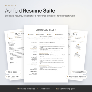
Ashford Resume Template Bundle
Price: $7.99 | Best for: polished one-pagers with a portal backup
Ashford gives you an executive-style resume in 1, 2 and 3 page versions with a framed name block and tidy sidebar, plus a separate single-column ATS set for online portals. A matching cover letter, reference page and thank-you letter are included, in three colour palettes and two paper sizes, with 10 filled examples and a job application tracker. The placeholder text tells you what to write, such as showing a result with a number. Start with the 1 page executive file and copy your text into the ATS version once it is done.
Tailoring a one-pager for each job
A one-page CV has no spare room, so tailoring is a swap, not an addition. For every new advert, something comes out so something more relevant can go in.
Keep a “bullet bank” in a separate document: every good bullet you have ever written, grouped by job. When an advert for a stock controller role stresses accuracy and supplier contact, swap in your bullet about catching a supplier invoicing error, and take out the one about window displays. When the next advert is for a visual merchandiser, swap them back.
Change your title line each time too, and one phrase in your profile. Those two edits plus two bullet swaps take about ten minutes. The page stays at one, and the reader sees a CV that looks written for their job, because it was.
A short CV deserves a short letter
A punchy one-page CV paired with a rambling two-page cover letter undoes your good work. Keep the letter to three short paragraphs: why this role, the two pieces of evidence that you fit, and a clear close. Around 250 words is plenty.
Make sure it looks like it belongs with the CV, same font, same header, same accent colour. Our guide on writing a cover letter that matches your resume shows how to line the two up so they read as one application.
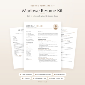
Marlowe Resume Kit
Price: $4.79 | Best for: tidy CV and letter sets
Marlowe includes a 1 page resume with and without a photo, longer 2 and 3 page versions, an ATS resume, and a cover letter, references page and thank-you letter that share the same calm header. Everything comes in Sand, Sage and Slate and both US Letter and A4. The bonus Resume Playbook explains cover letter structure and has before-and-after bullets. Write the one-page CV first, then reuse your two best results in the letter.
One-page checklist before you send
- Is the body font 10 point or larger?
- Are margins at least 1.8 cm, or about 0.7 inch?
- Does your title line match the job you are applying for?
- Is your strongest result visible in the top third?
- Do your two most relevant roles get most of the space?
- Is every bullet two lines or fewer?
- Is the page free of empty headings and leftover sample text?
- Does the PDF still fit on one page when you open it?
If you tick every box, send it. If one fails, it is usually a five-minute fix.
Mistakes that make a one-pager feel cramped
The most common one is a page with no white space. Headings jammed against text, no gap between roles, bullets running edge to edge. It technically fits but it reads like a legal form. Give each heading room above it, even if that means one less bullet.
The second is keeping every job. A one-page CV that lists eight roles, each with one thin bullet, says less than one that gives two roles real depth. The third is hiding the dates in tiny grey type. Readers want to see your timeline at a glance, so keep dates readable and lined up on the right.
The fourth is a skills section that eats half the sidebar with soft skills: communication, teamwork, time management, problem solving. Every applicant lists those. Use the space for things a reader can check, such as Excel pivot tables, a forklift licence, Spanish to conversational level or a named booking system. Show the soft skills inside your bullets instead, where they come with proof.
Frequently asked questions
Is a one-page CV better than two pages?
Not always. A one-page CV is better when your relevant experience fits without squeezing, which suits graduates, early career applicants and career changers. Senior applicants with long track records often need two pages.
How do I fit my CV on one page?
Cut your street address, old roles, long school details, hobbies and duty-only bullets first. Merge similar bullets and keep each to two lines. Avoid shrinking the font below 10 point or the margins below about 1.8 cm.
What should a one-page CV include?
Your name, title line and contacts, a short profile, your two most relevant roles with results, a summary of older roles, education and a skills line. Most of the space should go to experience.
Can a graduate CV be one page?
Yes, and it usually should be. A degree, part-time work, volunteering and one or two projects fit comfortably on one page and are easier for a graduate recruiter to scan.
Should a one-page CV have two columns?
For email and print, two columns help you fit more without crowding. For online portals, use a single-column version, because some screening software reads columns in the wrong order.
What font size works for a one-page CV?
Between 10 and 11 point for body text, depending on the font. Calibri and Arial read well at 10.5. Your name can be 20 to 26 point and section headings 12 to 13 point.
Your next step
Print your current CV, take a pen, and work through the eight cuts in order until it fits on one page at a readable size. Then move the result into a layout made for a single page, such as the 1 page file in the Ashford Resume Template Bundle.