A visual CV with one well-chosen colour accent stands out in a pile of black-and-white pages without looking like a poster. A soft sage header, a navy sidebar, a rose line under each heading. Small touches, but they make a recruiter’s hand pause on your page for a second longer.
Free templates with colour are easy to find. The harder part is picking one that still reads well when printed on an office laser printer, still makes sense to screening software, and does not look like a birthday card. Colour helps only when it is doing a job.
This guide covers where free visual CV templates come from, how to choose an accent colour that suits your field, exactly where colour belongs on the page, and when a low-cost set with matched colourways saves you hours of fiddling.
Quick picks: CV templates with colour accents
| Product | Best for | Price | Link |
|---|---|---|---|
| Sloane Resume Template | Stone, Sage and Navy accents on a modern layout | $4.49 | View |
| Hollis Resume Template | Champagne, Rosewood and Graphite with a colour sidebar | $8.99 | View |
| Alder Resume Template with Photo | A shaded header in Mocha, Sage or Slate | $4.79 | View |
| Marlowe Resume Template | The lightest touch: soft taupe in Sand, Sage or Slate | $4.79 | View |
What a visual CV is, and what it is not
A visual CV uses design to guide the eye. That usually means some mix of an accent colour, a photo or monogram, a sidebar, small icons next to contact details, and clear typographic contrast between your name, headings and body text.
It is not an infographic. Pie charts of your personality, bar graphs of your skills and timelines with little aeroplanes were popular for a while. They look busy, they take up space, and they do not tell a hiring manager anything useful. “Excel: 80 percent” leaves the reader wondering, 80 percent of what?
The best visual CVs look calm and finished. The colour signals care. The content still does the persuading.
Where to find free visual CV templates
There are honest, decent free options. Each has its limits, so it helps to know them before you start typing.
Built into Word and Google Docs
Both include a few CV templates with coloured headers or accents. In Word, go to File, then New, and search “resume”. In Google Docs, open the Template gallery. You can change the accent colour yourself by selecting a heading and picking a new font colour. These are reliable and print well, though the choice is small and many people use the same handful.
Online design tools with free plans
Several design platforms offer colourful CV layouts on free plans. Expect some to need an account, and some to keep certain templates or downloads for paying users. Check how they export. A PDF where the text is real text is fine. A PDF where the whole page is one picture looks lovely and reads as empty to application software.
College and careers services
University and college careers offices often share free templates in Word, sometimes with a colour accent in the institution’s style. They are a good option if you are a student or recent graduate, and someone there may review your CV too.
Free options suit a single application or a first CV well. If you want a wider look at what a paid template adds, our roundup of the best resume templates for Word and Google Docs compares 15 designs side by side.
Choosing an accent colour for your field
There are no strict rules, but some colours sit more naturally in some workplaces. Think of it as dressing for the interview. You would not wear the same outfit to a bank and a nursery.
| Field | Colours that tend to suit | Why |
|---|---|---|
| Finance, law, government | Navy, slate, charcoal | Steady and serious, prints cleanly |
| Healthcare, education, charity | Sage, soft teal, muted blue | Calm and approachable |
| Hospitality, beauty, events | Rosewood, champagne, warm taupe | Warm and welcoming |
| Tech, engineering | Graphite, slate, deep blue | Clean and modern |
| Marketing, design, media | Any muted tone you like, used with confidence | Shows taste without stealing focus |
Three rules for any colour
- Muted beats bright. A dusty sage looks expensive. A neon green looks like a warning sign.
- Dark enough to read. If you use the accent for headings, it needs strong contrast against white. Pale pink text on white disappears.
- One accent only. Black or dark grey for body text, one accent colour for everything else. Two accents start to fight.
A template that comes in several tested colourways takes the guesswork out of all three rules, because the shades have already been chosen to sit well together.
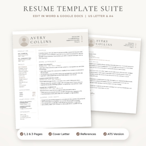
Sloane Resume Template
Price: $4.49 | Best for: people who want a tested colour palette
Sloane comes in three colour themes, warm Stone, soft Sage and classic Navy, with accent-coloured bullet points and a matching 40-icon pack in Stone, Sage, Navy, Charcoal and White. You get a 1-page resume with or without a photo, a 2-page resume, a 3-page CV, an ATS version, a cover letter and a references page, in US Letter and A4. Open all three colours of the 1-page file side by side and pick the one that suits your field.
Where colour belongs on the page
A useful guide: colour should cover roughly a tenth of the page or less. Here are the places it does the most good, from most to least useful.
- Section headings. The eye jumps from colour to colour, so coloured headings act like signposts.
- A header band or sidebar. A soft block of colour behind your name or down one side frames the page.
- Thin rules under headings or between sections.
- Bullet markers and contact icons. A small detail that makes the page feel finished.
- Your name. Sometimes. A dark accent on the name can work. A light one rarely does.
Where colour does not belong: body text, dates, job descriptions, and anything you need someone to read in full. Keep those dark.
Worked example: an events coordinator’s visual CV
Amara is applying for an events coordinator role at a hotel group. Her field rewards warmth and polish, so she picks a rosewood accent. Here is how she lays it out.
- Header: her name in a large serif, dark grey. A thin rosewood line underneath. Phone, email, city and portfolio link in small dark text with rosewood icons.
- Left sidebar: a pale blush background running the full height of the page. Inside: a round photo, skills, languages and certificates.
- Main column: headings in rosewood capitals. Experience in dark grey, with three bullets per job. One bullet reads: “Ran 45 weddings and corporate dinners a year, for groups of 20 to 300.”
- Footer: nothing. Clean white space.
The colour covers maybe eight percent of the page. It feels warm, organised and confident. And when she prints a test copy in black and white at the library, every heading is still clearly visible, because the rosewood is dark enough to turn into a solid grey.
Photos, icons and other visual extras
A photo is the biggest visual element you can add. It suits applications in many European, African and Asian countries and in face-to-face fields such as hospitality and sales. In the UK, the US and Canada most applicants leave it off. Our guide on whether to use a photo on your CV walks through where it helps and where it hurts.
If you do use one, keep it small, round or neatly cropped, with a plain background. A monogram of your initials is a tidy alternative that gives the header the same finished feel without the photo question.
Icons should be small and match your accent colour. A phone, an envelope, a pin for location. That is plenty. A row of 12 icons for your hobbies is not.
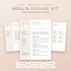
Hollis Resume Template
Price: $8.99 | Best for: warm fields like hospitality and events
Hollis has a clean colour sidebar that grows with your content, in Champagne, Rosewood and Graphite. Each design comes as a photo version and a monogram version in 1, 2 and 3 pages, plus a 1 and 2 page ATS resume, cover letters, a references page and a thank-you letter. You also get 36 line icons and round contact icons in all three colourways (PNG and SVG), a Round Photo Maker and a Job Search Planner, in US Letter and A4.
Keeping a visual CV readable by software
Here is the honest trade-off. The more visual a CV gets, the harder it can be for applicant tracking systems to read. Sidebars may be read in the wrong order. Text in images is skipped. Icons can turn into odd symbols.
The simple answer is to keep two versions:
- Your visual CV for emailing to a person, handing over at a careers fair, attaching to a direct message, or bringing to an interview.
- A plain single-column version with the same words for uploading to online portals.
That way you never have to choose between looking good and being read. Our ATS resume template guide explains what the plain version needs.
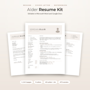
Alder Resume Template with Photo
Price: $4.79 | Best for: people who need visual and plain versions
Alder pairs a two-column design with a shaded header and round photo with a separate ATS-friendly resume in one column with no tables, icons or images. Both come in Mocha, Sage and Slate, in US Letter and A4, along with 2 and 3 page versions, a no-photo design, matching letters and 48 line icons in four colours. The Excel Job Application Tracker lets you note which version you sent where.
Printing and screen tips
Colour looks different on every screen and every printer. A few checks save you from surprises.
- The greyscale test. Print one copy in black and white. If any heading fades or vanishes, choose a darker shade.
- The phone test. Open the PDF on your phone. Many recruiters read on mobile now. Pale accents and thin fonts suffer most on small screens.
- Full-page backgrounds. A coloured sidebar that runs to the edge may get a white border on home printers. That is normal and looks fine.
- Paper. For printed copies, a slightly heavier bright white sheet makes colours look cleaner than thin office paper.
Common mistakes with colour on a CV
Too many colours
Blue headings, a green sidebar, orange icons. Each looked nice alone. Together they look like a toy box. Pick one.
Light colours for text
Pale yellow, light pink and sky blue are fine for backgrounds. As text, they are close to unreadable.
Colour as the only signal
If your headings differ from body text only by colour, someone printing in black and white loses them. Make headings bold or capitals as well.
A cover letter in a different style
Your CV has a navy sidebar and your cover letter is plain Times New Roman. Use the same header and accent on every page you send.
Changing the colour for every application
It is tempting to fiddle. Choose one colour that suits your field and stick with it, so the hour goes into the words instead.
Frequently asked questions
Are coloured CVs professional?
Yes, when the colour is muted and used lightly, for headings, a sidebar or a thin line. Most hiring managers see a single accent as a sign of care. Bright colours across the whole page can look less serious.
What is the best colour for a CV?
Navy and slate are safe almost everywhere. Sage suits healthcare and education. Warm tones such as rosewood suit hospitality and creative roles. Choose a shade dark enough to stay visible when printed in black and white.
Where can I get a visual CV template for free?
Microsoft Word and Google Docs both include CV templates with colour accents. Some online design tools offer free plans, and college careers services often share Word templates. Check that the download keeps your text as real, selectable text.
Will a visual CV pass ATS software?
Not always. Sidebars, icons and images can confuse it. Keep a plain single-column version with the same words for online portals, and use your visual version when sending to a person.
Should I put a photo on a visual CV?
It depends on the country and field. A photo is common in much of Europe and in face-to-face roles. In the UK, US and Canada most applicants leave it off. A monogram is a tidy middle ground.
Can I change the colour of a Word CV template?
Yes. If the template uses proper styles, changing the colour of one heading style updates them all. Templates sold in several colourways save you doing it by hand.
Your next step
Decide on one accent colour for your field using the table above, then print your current CV in black and white to see which parts would need it. If you would rather start from a page where the colours are already matched and tested, open the Sloane Resume Template, choose Stone, Sage or Navy, and type your details straight in.