CVs that get read have one thing in common. The important details sit exactly where a busy reader’s eyes land first. A recruiter with 80 applications and a meeting in half an hour isn’t going to hunt. If your last job title, your strongest result and your key skill are visible in the first glance, you get a proper read. If they are buried in a paragraph halfway down page two, you probably don’t.
This guide is for anyone who has sent a stack of applications and heard very little back. You will see how people actually skim a CV, how to build a top third that does the heavy lifting, which layout choices help and which get in the way, and a simple 30-second test to run before you hit send. We also point to a few Taskdale templates designed with a quick scan in mind.
Quick picks: CV templates and tools built for skimming
| Product | Best for | Price | Link |
|---|---|---|---|
| Slatewell ATS Resume Template | Experienced and executive CVs with clear heading bars | $7.49 | View |
| Quillmark ATS Resume Kit | Graduates and career changers needing an education-first layout | $7.49 | View |
| Wellspoken LinkedIn Profile and Interview Prep Workbook | Making your LinkedIn tell the same story | $6.99 | View |
| Offerline Job Application Tracker | Seeing which CV version gets replies | $5.99 | View |
How a recruiter really reads your CV
Nobody reads a CV like a novel, top to bottom, every word. The first look is a skim. Eyes go to the name, then the most recent job title and employer, then the dates, then down the left edge looking for more titles. Numbers catch the eye on the way. Bold text catches it too. Long grey paragraphs mostly get skipped.
That first skim answers a single question: is this person worth a proper look? It is often over in well under a minute. Only if the answer is yes does the reader slow down and take in the detail.
So the job of your layout is simple. Put the answers to that question exactly where the skimming eye goes. Current or last title. Years of relevant experience. One or two strong results. The skills the ad asked for. Everything else is supporting detail for the second read.
Make the top third do the heavy lifting
The top third of page one is prime space. On an A4 page, that is roughly the first 10 centimetres. Here is what belongs there.
Name and contact details
Your name in a slightly larger size. Underneath, on one line: phone, email, town or city, and a LinkedIn link if you have one. No full home address needed. Keep these in the body of the page rather than in the document header, as some applicant tracking software skips headers.
A headline that matches the job
One line under your name that says what you are. Customer Service Team Leader. Registered Nurse, Paediatrics. Junior Data Analyst. If it matches the job title in the ad, the reader knows in a second that you are in the right pile.
A three-line summary
Not a paragraph about being a hard-working team player. Three short lines: what you do, how long you have done it, and one result that proves you are good at it. For example: Team leader with 6 years in busy contact centres. Run a team of 12 handling around 400 calls a day. Brought average wait times down from 4 minutes to under 2 in a year.
That summary does more work than a whole page of duties. A reader who stops there already knows your level, your setting and your proof.
Layout choices that help a quick scan
A clean CV is not a plain one. It is one where the structure does the guiding. These choices make the biggest difference.
- One column. The eye moves straight down. Two-column layouts split attention, and some tracking software reads them in the wrong order.
- Job titles on the left, dates on the right. The reader can run down the left edge for titles and the right edge for dates, without reading anything else.
- Bold for job titles, not whole sentences. Bold stops working when everything is bold.
- Clear section headings. Experience, Education, Skills. Plain words that anyone and any software will recognise.
- White space. Margins of about 2 centimetres, a little space between jobs. Crammed pages feel like hard work before a word is read.
- A readable font at 10.5 to 12 point. Calibri, Arial, Garamond, Georgia. Nothing a reader has to squint at.
- Consistent formatting. Every date in the same style, every bullet the same shape. Inconsistency makes readers slow down for the wrong reasons.
Most people don’t need to build this from scratch. A good template has these choices baked in, so you only add your words.
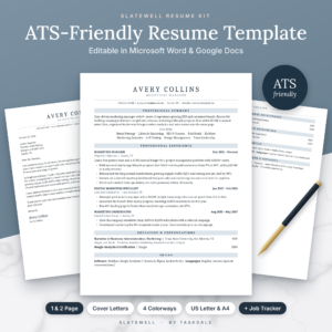
Slatewell ATS Resume Template
Price: $7.49 | Best for: experienced staff and managers
Slatewell is a single-column CV kit for Word and Google Docs with four layouts, including an Executive layout with Career Highlights and Core Competencies, plus two cover letters, a references page and a thank-you letter. Soft slate heading bars and generous white space make it easy to skim, and there are no text boxes, tables or icons. It comes in four colourways in US Letter and A4 with a bonus job tracker. Start with the layout closest to your level.
Bullets that survive being skimmed
Under each job, bullets do the talking. But a skimming reader only takes in the first few words of each one. So lead with what matters.
Put the result or the number first
Compare these two:
- Responsible for managing the stock ordering process for the store, which helped to reduce waste.
- Cut weekly stock waste by about a third by reworking the ordering process for a 30-person store.
The second one says cut waste by a third in the first eight words. Even a skim catches it.
Keep each bullet to one or two lines
Three-line bullets turn into paragraphs, and paragraphs get skipped. If a bullet runs long, split it or trim the setup.
Three to five bullets per recent job
Your last two roles can have four or five. Older jobs need one or two, or just a title and dates. A role from 2011 does not need eight bullets about the filing system.
Use the words from the job ad
If the ad says stakeholder management, and you have done it, say stakeholder management, not working with colleagues. The reader is scanning for those words, and so is the software.
Choose a section order that fits your situation
There is no single right order. Put your strongest section second, right after the summary, because that is where the eye goes next.
| Situation | Suggested order |
|---|---|
| Experienced, same field | Summary, Experience, Skills, Education |
| Graduate or student | Summary, Education, Projects, Experience, Skills |
| Career changer | Summary, Key Skills, Relevant Projects or Training, Experience, Education |
| Returning after a break | Summary, Key Skills, Experience, Recent Training, Education |
A graduate with a strong dissertation and a society role should lead with education. A career changer moving from retail into admin should lead with the transferable skills, so the reader sees the match before the job titles that don’t obviously fit.
How long should it all be? For most people, one or two pages. Our guide to how long a CV or resume should be compares one, two and three-page versions in detail.
If you are just starting out or switching paths, an education-first template saves a lot of reshuffling.
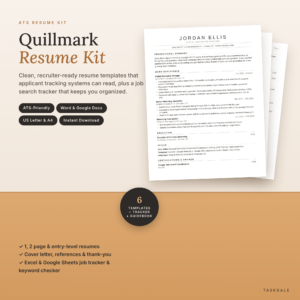
Quillmark ATS Resume Kit
Price: $7.49 | Best for: graduates and career changers
Quillmark gives you six matching Word templates, each in US Letter and A4, editable in Word or Google Docs. Alongside one-page and two-page CVs, there is an Entry-Level layout that puts education first with Projects and Leadership sections, plus a cover letter with a guided four-paragraph structure and a references page. A job search tracker is included. Pick the Entry-Level layout if you have under two years of experience.
Things that slow a reader down
Some design choices look striking but get in the way of a quick scan. Think twice about these.
- Skill bars and star ratings. Four stars out of five in Excel tells a reader nothing. Write what you did with Excel instead.
- Icons for phone and email. Fine for people, but often lost or garbled by tracking software.
- Text boxes and sidebars. They can scramble when the file is read by software or opened on a different computer.
- Dense paragraphs. Anything over three lines without a break is likely to be skimmed past.
- Fancy fonts. Script or very thin fonts are hard to read on a screen.
- A photo where it isn’t expected. Customs vary by country and sector. Our guide on CVs with or without a photo covers when it helps and when it hurts.
The 30-second test before you send
Before every application, run this quick check. It takes half a minute and catches most problems.
- Squint test. Look at the page from arm’s length, or zoom out to 50%. Can you see clear blocks, with titles standing out? If it is one grey mass, add space.
- Ten-second friend test. Hand it to a friend for ten seconds, then take it back. Ask what they remember. If it isn’t your title and a key result, rework the top third.
- Plain-text test. Copy all the text and paste it into a plain note. Does it come out in the right order, with nothing missing? If not, something in the layout is confusing software.
- Keyword test. Can you find the top three words from the job ad within the first half of page one?
It is a small ritual, but it brings a calm sort of confidence. You know the page works before anyone else sees it.
Make your LinkedIn tell the same story
Many recruiters glance at LinkedIn after a CV catches their eye. If your profile has a different job title, different dates or an empty About section, it raises questions you don’t want. Match the facts, use a similar headline, and put the same one or two key results in your About section.
Interview prep follows naturally from there. Every strong bullet on your CV is a story you may be asked to tell, so it helps to write those stories down before the call comes.
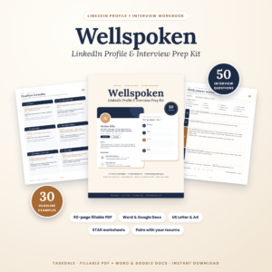
Wellspoken LinkedIn and Interview Workbook
Price: $6.99 | Best for: active job seekers
Wellspoken pairs with your CV in two parts. Part 1 has LinkedIn headline formulas, 30 example headlines, About section templates and networking messages, so your profile tells the same story. Part 2 is an interview workbook with 50 common questions, STAR answer worksheets, company and salary research pages and thank-you emails. Use it as a 50-page fillable PDF or edit in Word and Google Docs. Start by matching your CV facts to your profile.
How to tell if your layout is working
Track your replies. If you send 20 applications to jobs you are qualified for and hear nothing, the CV is often the first suspect. Change one thing, such as the top third or the bullet style, and send the next 10. Compare the reply rate. A simple tracker that logs which version went to which job makes this easy, and it turns a frustrating search into something you can actually improve.
If you edit in Google Docs, our step-by-step guide to making a CV in Google Docs shows how to keep the layout clean when you export to PDF.
Frequently asked questions
What is the best CV layout for recruiters?
A single-column layout with your name, contact details, headline and short summary at the top, then clearly headed sections with job titles on the left and dates on the right.
What should be in the top third of my CV?
Your name, contact details, a headline that matches the job title and a two or three-line summary with one clear result.
How many bullet points should each job have?
Three to five for your most recent roles, one or two for older ones. Keep each bullet to one or two lines and lead with the result.
Are two-column CVs bad?
They can look attractive, but they are harder to skim and some tracking software reads them in the wrong order. A single column is the safer choice for most applications.
What font size should a CV use?
Between 10.5 and 12 point for body text, with your name a little larger. Pick a clean font like Calibri, Arial or Georgia.
Your next step
Print your current CV, hold it at arm’s length and ask what jumps out first. If it isn’t your title and your best result, rebuild the top third tonight. For a layout that already puts those details where eyes land, start with the Slatewell ATS Resume Template.