The CV templates that look most impressive in a shop preview are often the ones that do the worst job. Pie charts of your personality. Five-star ratings for teamwork. A timeline that winds across the page like a board game. They catch the eye for a second, and then they get in the way of the one thing a recruiter wants to know: can this person do the job?
This article explains why good CV templates don’t need fancy graphics, with four plain reasons and real examples. Then it shows what clean design does instead, when a touch of visual flair is perfectly fine, and how to test whether your own CV has tipped into too busy.
If you have ever felt that your plain CV looks boring next to a friend’s colourful one, this is for you. Plain is not boring. Plain is readable, and readable gets interviews.
Quick picks: clean CV templates without the clutter
| Product | Best for | Price | Link |
|---|---|---|---|
| Marlowe Resume Template | Calm, classic layout with lots of white space | $4.79 | View |
| Sloane Resume Template | Modern two-column design that stays put when edited | $4.49 | View |
| Hollis Resume Template | A soft touch of colour without the noise | $8.99 | View |
| Alder Resume Template with Photo | Quiet design plus a job tracker | $4.79 | View |
What counts as fancy graphics on a CV
Before we get into why, it helps to be clear about what we mean. Not all design is bad. A coloured heading or a thin line between sections is fine. The trouble starts with graphics that try to replace words.
- Skill bars and dots for soft skills. Leadership shown as four out of five circles.
- Pie charts and donut graphs. Thirty percent creative, forty percent analytical, thirty percent organised.
- Infographic timelines. Jobs placed along a curved line with dates in bubbles.
- Icon grids for hobbies. A little plane, a camera and a coffee cup.
- Heavy background colour. A dark sidebar that runs the full height of the page, or a patterned header.
- Text inside shapes. Your profile written inside a circle, or your name inside a hexagon.
Each of these looks clever on its own. Put four of them on one page and the page starts to feel like a poster rather than a record of what you have done.
Reason one: recruiters read words, not pictures
A skill bar showing Excel at 80 percent tells a recruiter almost nothing. Eighty percent of what? Compared to whom? Does it mean you can build a pivot table, or that you once sorted a column? The bar looks precise, but it carries no real information.
Compare it with one plain line: Built a monthly sales report in Excel using pivot tables and lookups, cutting prep time from two days to three hours. That line is shorter than most skill bar sections, and it answers every question the bar raised.
Recruiters scanning 150 CVs for one admin role do not have time to decode graphics. They read your name, your current title, your most recent job and its first bullet or two. If those spaces are filled with charts and icons, the useful facts get pushed further down the page, where fewer people look.
There is also a quiet credibility problem. Rating yourself five out of five for communication can feel a little odd to the person reading it. A sentence that shows you presented quarterly figures to a board of eight directors does the same job without asking anyone to take your word for it.
Reason two: screening software cannot see graphics
Many larger employers run CVs through screening software before a person reads them. That software reads text. It does not read images, and it often struggles with text inside shapes, text boxes and complex columns.
So a skill rating built from images may simply disappear. A profile written inside a circle may be skipped. A timeline might come out with all the dates in one block and all the job titles in another, so the software cannot tell which job happened when. You would never know, because the CV looks fine to you.
This is why so many template kits now include a plain, one-column version for online portals. Our ATS resume template guide goes into detail on what screening software can and cannot read.
Reason three: graphics break when you edit or print
Fancy designs are usually built from floating shapes and text boxes. They look perfect with the sample text. Then you type your real job title, which is eleven characters longer, and the box overflows. You add a third job and the timeline runs off the page. Every change becomes a small battle.
Printing adds another problem. A dark sidebar that looks smart on screen can use a lot of ink and come out streaky on an office printer. Pale grey text on a coloured background can turn unreadable when someone prints your CV in black and white for an interview panel, which happens more often than you might think.
And if you open a graphics-heavy Word file in Google Docs, shapes often shift or vanish entirely. A plain, table-based template moves between programs with far less fuss.
Sloane is a good example of the opposite approach. It was built from simple tables and real Word styles, with no floating text boxes, so the layout holds when you edit.
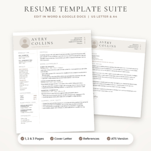
Sloane Resume Template
Price: $4.49 | Best for: a modern look that edits cleanly
Sloane includes a 1-page resume with and without a photo, a 2-page resume, a 3-page CV, an ATS version, a cover letter and a references page, each in Stone, Sage and Navy and in both US Letter and A4. Columns flow onto a new page when you add content, and one style change restyles every heading. Open the 2-page version and add your longest job first to see how it grows.
Reason four: every graphic takes space from your evidence
A CV has limited room. One page for most people, two for experienced professionals. Every square centimetre spent on a chart is a square centimetre not spent on proof.
Picture a sales manager with a half-page infographic timeline. That same space could hold six bullets: the territory she grew by 22 percent, the team of nine she hired, the two largest accounts she won, the training programme she wrote. The timeline shows that she had jobs. The bullets show that she was good at them.
When you are deciding between a graphic and a sentence, ask a simple question: which one would a hiring manager quote back to me in an interview? Nobody has ever said, I loved your donut chart. Plenty of people have said, Tell me more about how you grew that territory.
What good design does instead
Removing fancy graphics does not leave you with a dull page. It leaves room for the kind of design that actually helps a reader. Good CV design is mostly invisible.
Clear hierarchy
Your name is largest. Section headings are next. Job titles stand out from company names. Dates sit in the same place every time. A reader’s eye knows where to go without being told.
Generous white space
Space between sections is not wasted. It lets a reader breathe and find the next heading. A page with a little air in it reads faster than a crammed one.
One accent colour
A single soft colour for headings or thin lines adds personality without noise. Navy, sage, slate or a warm taupe all print well and look professional.
Two fonts at most
One for headings, one for body text. A classic pairing like a serif name over a clean sans-serif body looks polished in every field from law to logistics.
Marlowe shows how far you can get with these four things alone: a wide-spaced serif name, soft taupe accents and plenty of white space.
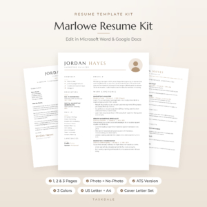
Marlowe Resume Template
Price: $4.79 | Best for: people who like a calm, classic page
Marlowe comes with 10 editable Word templates in Sand, Sage and Slate, each in US Letter and A4: 1, 2 and 3 page CVs with and without a photo, an ATS version, a cover letter, references page and thank-you letter. Fonts are embedded and every heading uses a named style. Start with the filled-in example PDF to see how a finished page reads before you type your own.
When a little visual flair is fine
None of this means every CV must be black text on white paper. A few visual touches earn their place.
- Small contact icons. A tiny phone and envelope next to your details help the eye and take almost no space.
- Language level dots. For languages, a simple five-dot scale is widely understood, especially when paired with a word like Fluent or Conversational.
- A photo where it is expected. In much of Europe, the Middle East and Asia, a professional headshot is normal. In the UK, US, Canada and Australia, leave it off.
- Creative roles. A graphic designer, illustrator or photographer may want more visual personality. Even then, the CV itself should stay readable, with the real creative work shown through a portfolio link.
The rule of thumb: a graphic is fine if it helps someone find information faster. It is a problem if it replaces information that should be in words.
Hollis strikes this balance well. It has a soft champagne colourway, round contact icons and a monogram option for anyone who prefers initials to a photo.
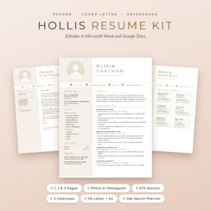
Hollis Resume Template
Price: $8.99 | Best for: a gentle touch of colour and polish
Hollis comes in Champagne, Rosewood and Graphite, with photo and monogram CVs in 1, 2 and 3 pages, a 1 and 2 page ATS version, a cover letter, references page and thank-you letter. It also includes a Job Search Planner for Excel and Google Sheets and a Resume Writing Guide with 216 action verbs. Try the monogram version if you want a little personality without a headshot.
Swap list: fancy elements and their plain replacements
| Fancy element | Plain replacement that works harder |
|---|---|
| Skill bars for software | A list of tools with where you used them: Xero, used daily for 3 years |
| Five-star rating for teamwork | A bullet showing teamwork: Led a team of six through a system changeover |
| Personality pie chart | A two-sentence profile that says what you do and what you are good at |
| Infographic timeline | Jobs listed newest first, with dates aligned on the right |
| Hobby icon grid | One short line of interests, only if they add something |
| Dark full-height sidebar | A light sidebar or a single column with a thin accent line |
Make three of these swaps and your CV will probably gain half a page of space for real results.
A quick test: is your CV too busy?
Print your CV, or open it full screen, and give yourself ten seconds. Then look away and answer these questions.
- What is my current or most recent job title?
- What is one result I achieved there?
- How do you contact me?
If any answer was hard to find, something on the page is louder than it should be. Next, count the graphics: icons, bars, charts and shapes. More than six or seven usually means it is time to strip some back. Finally, print a copy in black and white. If any text becomes hard to read, change the colour or background behind it.
If you are shopping for a new design, our comparison of the best resume templates for Word and Google Docs lines up 15 options, and our piece on free versus paid resume templates explains what a paid kit adds beyond the look.
Frequently asked questions
Do recruiters like creative CV designs?
Most prefer a clean, readable layout. Creative designs can work for design jobs, but even there the CV should be easy to scan, with the creative work shown in a portfolio.
Are skill bars bad on a CV?
For software and soft skills, yes, because they carry no real meaning and screening software often cannot read them. A short list of tools with context works better.
Is a plain CV boring?
Not if it is well laid out. Good spacing, one accent colour and clear headings make a page look polished. What makes a CV memorable is what you achieved, not how it is decorated.
Can I use colour on my CV?
Yes. One soft accent colour for headings or lines is fine and adds personality. Keep body text dark so it prints clearly.
Should I use icons on my CV?
Small icons beside your contact details are fine. Avoid icons that replace words, such as hobby pictures with no labels.
Your next step
Open your CV, find the biggest graphic on the page, and replace it with two bullets that show a real result. If your template fights you every time you edit it, move your content into a clean layout such as the Marlowe Resume Template and let your experience take the space.